
When we talk about digital products, we often start with practical questions.
Is the website easy to use?
Can the user find what they need?
Does the app work clearly and quickly?
All of this matters. A product should be functional, reliable, and understandable. But I believe that good design should also create a feeling.
Sometimes a website looks professional, but feels cold. Sometimes an app works well, but you do not want to return to it. And sometimes one small illustration, a friendly character, a soft colour palette, or a thoughtful empty state can make the whole experience feel warmer and more human.
This is where emotional design becomes important.
For me, emotional design is about understanding not only what users need to do, but also what they need to feel while using a product. It can be safety, clarity, control, belonging, confidence, curiosity, play, meaning, or delight.
As an illustrator and designer, this topic feels especially close to me. Illustration is often seen as decoration, but I see it as one of the tools that can shape the emotional experience of a product.
Before we can create joy, surprise, or emotional connection, the product needs to feel clear.
If users feel lost, unsafe, or unsure, they will not notice how beautiful the visuals are. They will only feel stress. This is why basic emotional needs like safety, clarity, and control come first.
In illustration-led design, this means that visuals should not make the interface heavier or more confusing. They should support the user.
An illustration can help explain a step.
A mascot can guide the user through onboarding.
A clear icon can make navigation easier.
A friendly error image can make a mistake feel less frustrating.
Good emotional design does not distract from the task. It makes the task feel easier.
People react to visual language very quickly. Before they read the text, they already feel something from the colours, shapes, characters, spacing, and overall mood.
This is where illustration becomes powerful.
Soft rounded shapes can feel friendly.
Bright colours can create energy and curiosity.
Hand-drawn details can make a product feel personal.
A consistent character system can make a brand feel familiar.
In children’s products, this is especially important. Children often connect with a product through characters, stories, colours, and small emotional details. A learning app, game, book, or educational website should not only explain information. It should invite the child into the experience.
But the same principle works for adults too. We all respond to warmth, clarity, humour, beauty, and personality.
A good example is Duolingo. The app could be just a simple language-learning tool, but its mascot, playful illustrations, tiny animations, rewards, and funny reminders make the experience feel more alive.


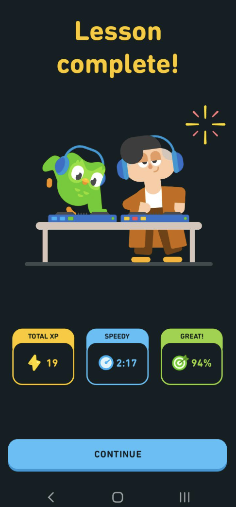
One of my favourite parts of illustration-led design is creating mascots.
A mascot can do much more than decorate a brand. It can become a small emotional guide inside the product.
It can welcome the user.
It can celebrate progress.
It can soften an error message.
It can explain something complicated.
It can make a brand easier to remember.
For example, in a children’s swimming school, a mascot can help children feel safe and excited before learning something new. In an educational app, a character can turn a lesson into a small adventure. In a brand system, a mascot can create a sense of personality that people recognise across packaging, social media, websites, and printed materials.
This is emotional design in practice. The character is not just “cute.” It has a job.
.png)

Once a product feels clear and safe, design can support deeper emotions.
This is where users start to feel curious, confident, playful, and connected. Progress indicators, friendly messages, small rewards, customisation, microinteractions, and playful visual systems can all help build this feeling.
For me, this is the space where illustration works beautifully.
A progress screen can feel like a small achievement.
A sticker or badge can make learning more rewarding.
A character reaction can make feedback feel alive.
A playful visual world can encourage exploration.
This is especially useful in products for children, because play is not an extra feature. It is part of how children learn, understand, and stay interested.
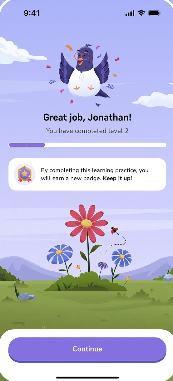
The feeling of a product rarely comes from one big visual idea. It usually comes from many small decisions working together.The shape of a button.
The tone of an empty state.
The expression of a character.
The rhythm of an animation.
The colour of a background.
The way an error message is written.
The level of detail in an illustration.
All of these details create the emotional atmosphere of a product.
This is why I like to think about illustration as part of the system, not as something added at the end. If the product needs to feel calm, the illustration style should support that. If it needs to feel playful, the characters, shapes, and colours should carry that feeling consistently. If it needs to feel trustworthy, the visual language should not feel chaotic or random.
Emotional design is not about adding cute details to a finished product.
It is about understanding people better. It is about noticing what they may feel at each step and using design to support that experience.
A good product should work well. It should be clear, reliable, and easy to use. But the products we remember usually do something more.
They make us feel safe.
They make us smile.
They make us curious.
They make us want to come back.
For me, this is where illustration becomes more than a visual style.
It becomes part of how the product feels.


