Educational UX/UI project focused on designing a meal planning
and grocery delivery service.
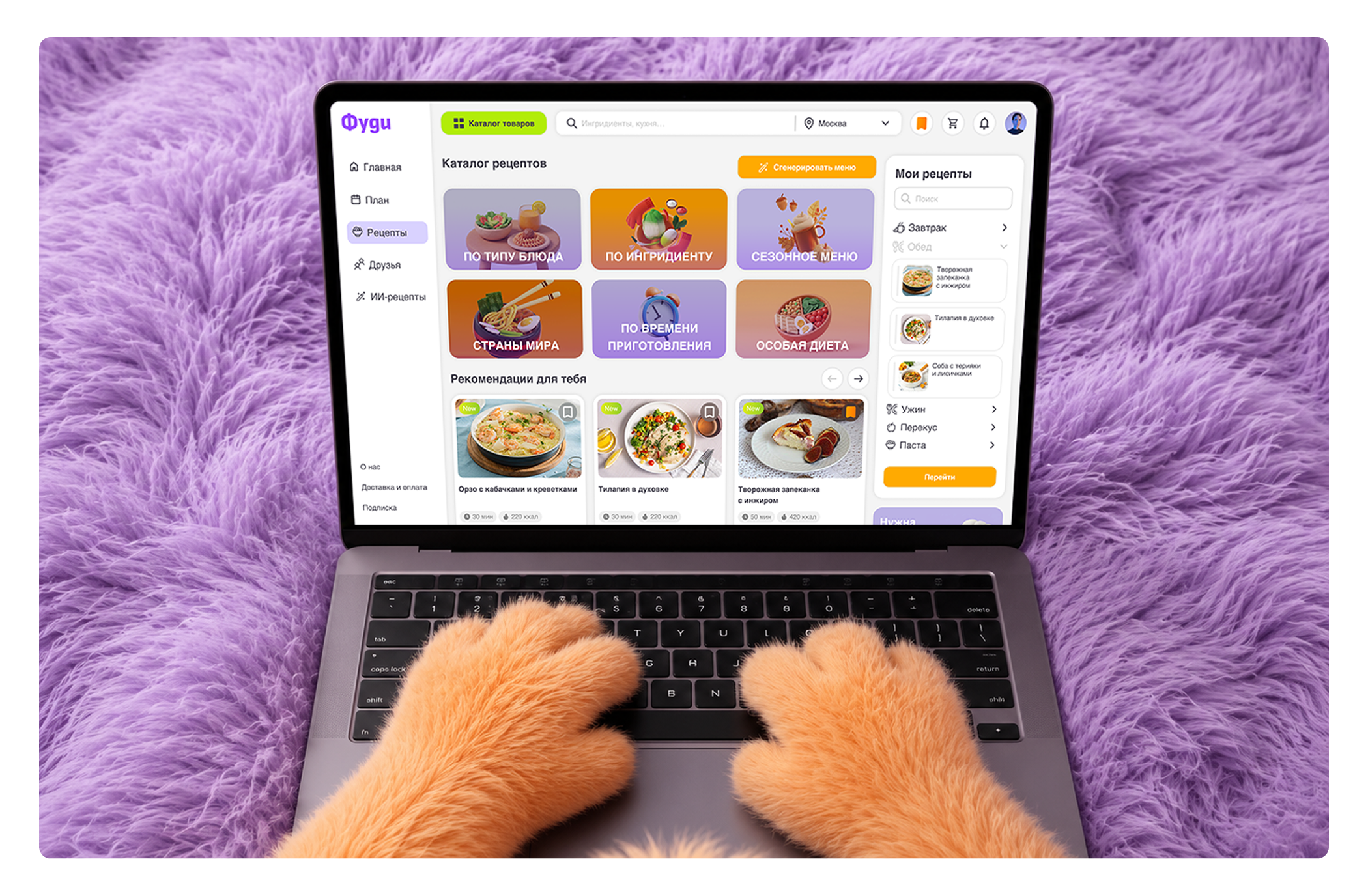
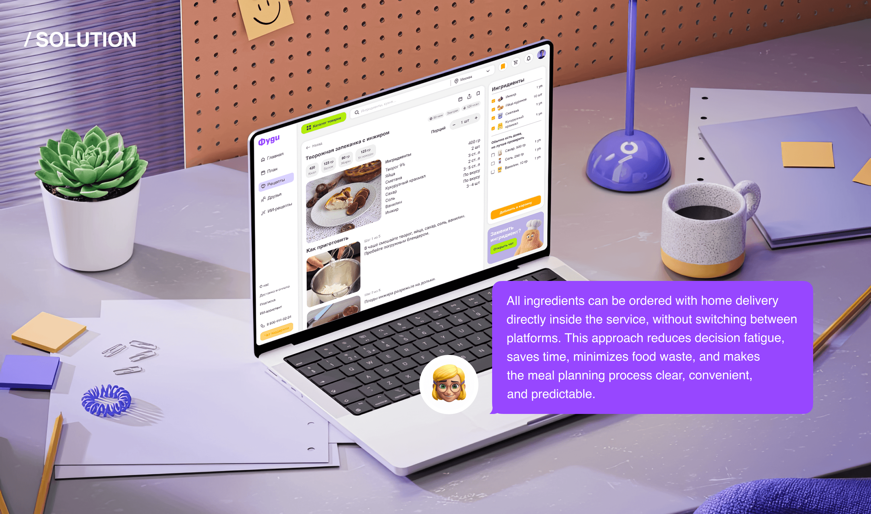
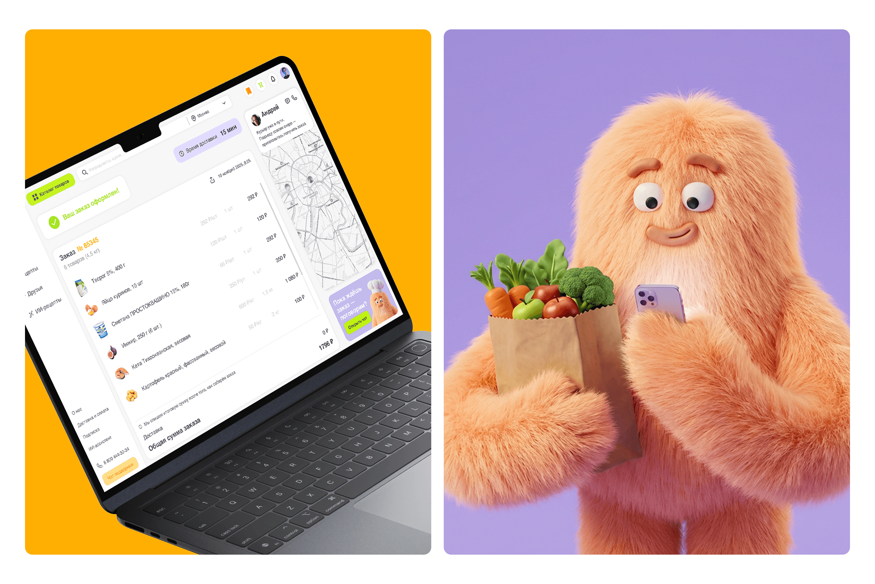
The platform uses an AI assistant to help users create personalized meal plans based on dietary preferences, allergies, and time constraints, while also suggesting ingredient substitutions and meal ideas. The AI can recognize recipes from screenshots saved from platforms like Instagram
and Pinterest, organize them into a personal recipe library, and automatically generate a grocery basket.
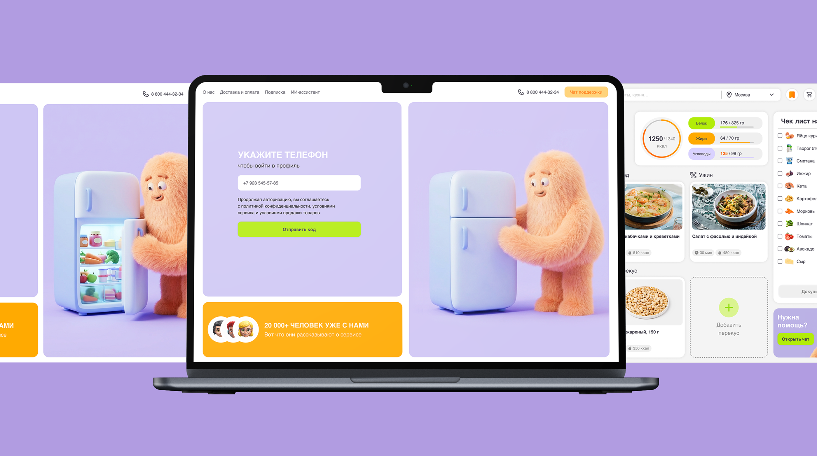
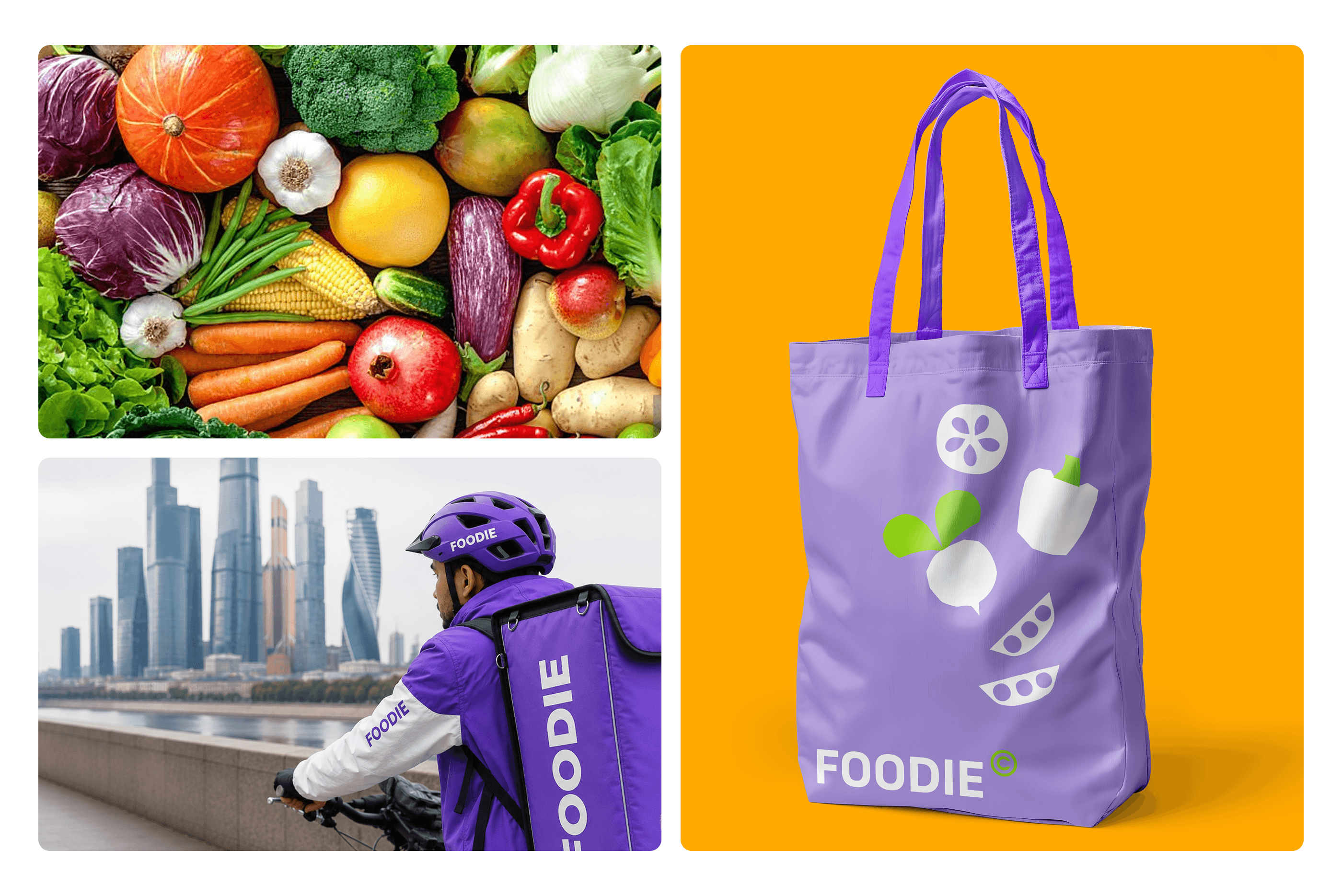
To create a more emotionally engaging experience, I designed Foody,
a friendly mascot that brings warmth, comfort, and a sense of support to
the service, transforming meal planning from a stressful task into a simple and approachable experience.
deliverables/
client/
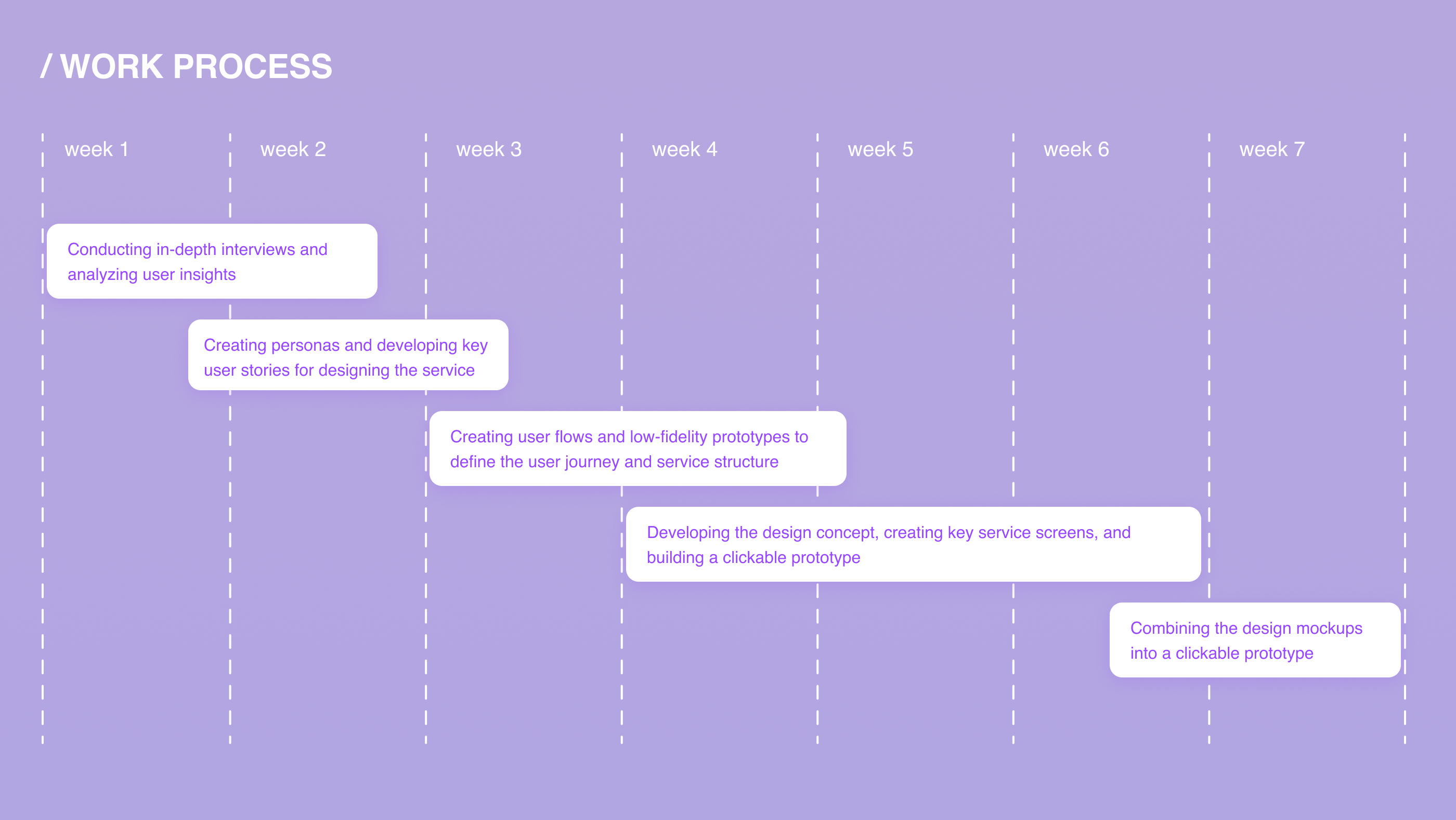
user research
user persona
user flows
wireframes
ui design
interactive prototype
visual system
educational project
(Bang Bang Education School)